While these features have already been launched by YouTube, there is a chance that not all users will see them immediately, but soon, the YouTube streaming platform will be redesigned for everyone.
This redesign comes just under two weeks after a big update to YouTube’s mobile app.
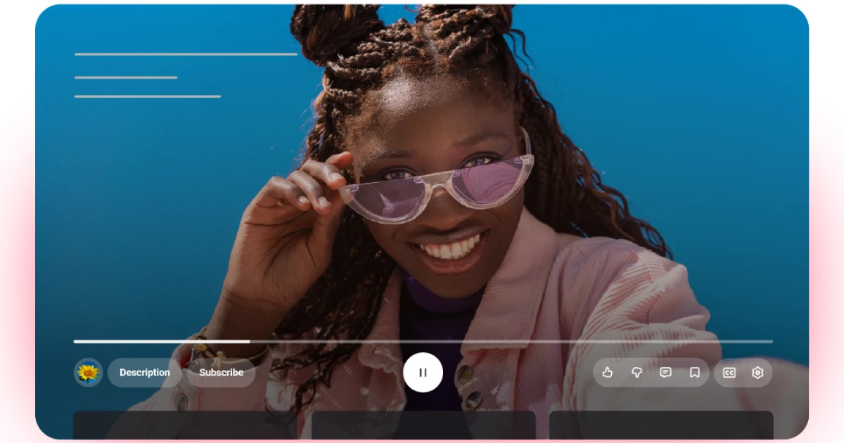
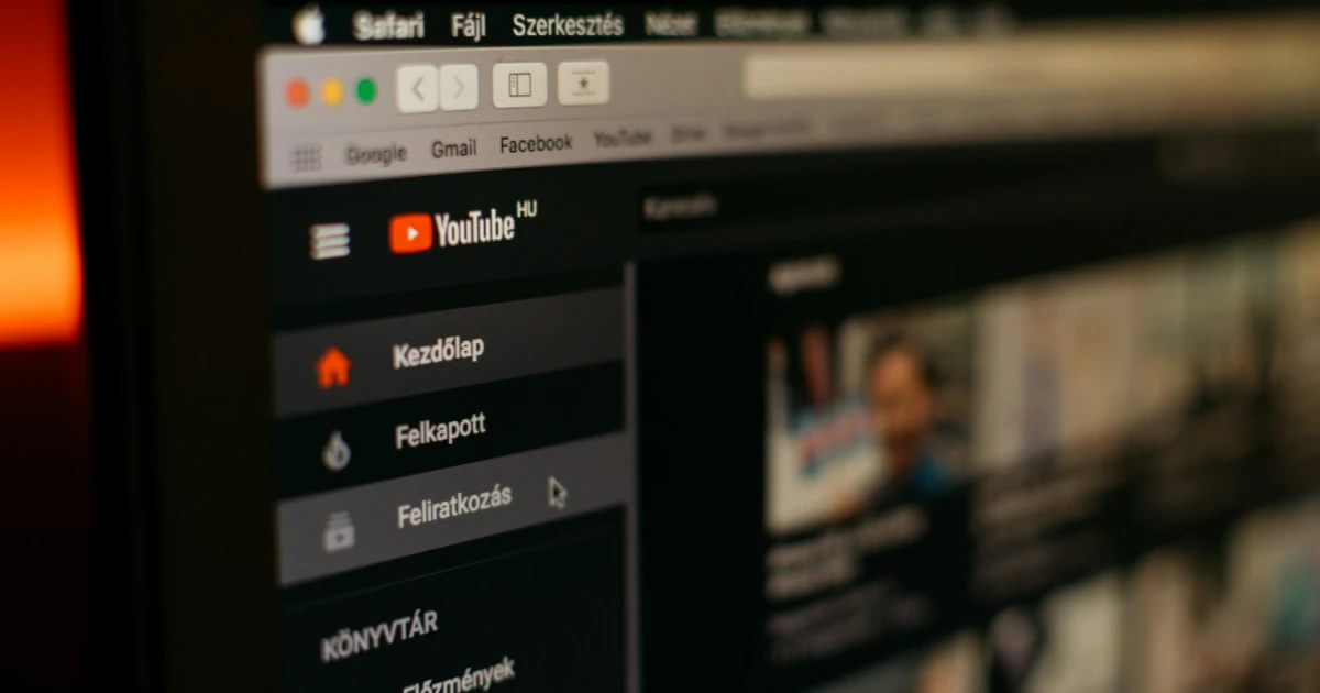
The most noticeable change is the new video player, with updated icons and elements that are more transparent, so they don’t block the video as much. You probably noticed that the YouTube icons were often blocking the video, not entirely, but the lower part of it.
We don’t know if YouTube was inspired by Apple’s new iOS 26 design, with a more transparent look, but it's for sure a great redesign.
A YouTube announcement described the updated app as having a “cleaner and more immersive” player. This includes improvements to the “Seek” feature, which lets you double-tap to skip, designed to feel more “modern and less distracting.”
Switching between tabs on mobile should now feel smoother. Transitions between tabs on mobile have also been updated. The new design appears more bubbly and transparent. Buttons now have clearer outlines, and instead of just icons on the player bar, they appear inside distinct circles. Now this design is so much better compared with the original YouTube player design.
Even more so, YouTube simplified the process of adding videos to the watch later list or to your playlist. It seems that YouTube really considered that it’s time for a real design upgrade, with lots of new small features that make the experience even better than before.
Subscribe to our newsletter
Well, while some users consider this new design a fresh and new appearance, others are not as happy as YouTube expected. In various social media posts and chats, users complain about the new YouTube design and say that this streaming platform should not be changed at all.
We must say that things are rapidly changing, and social media and streaming platforms need to be up to date with all the trends in order to remain relevant and captivating for their users.
Stay tuned for more!